
New Art made in April: Wild Roses, Peaches, and Freesia — A Mediterranean‑Inspired Watercolor Collection
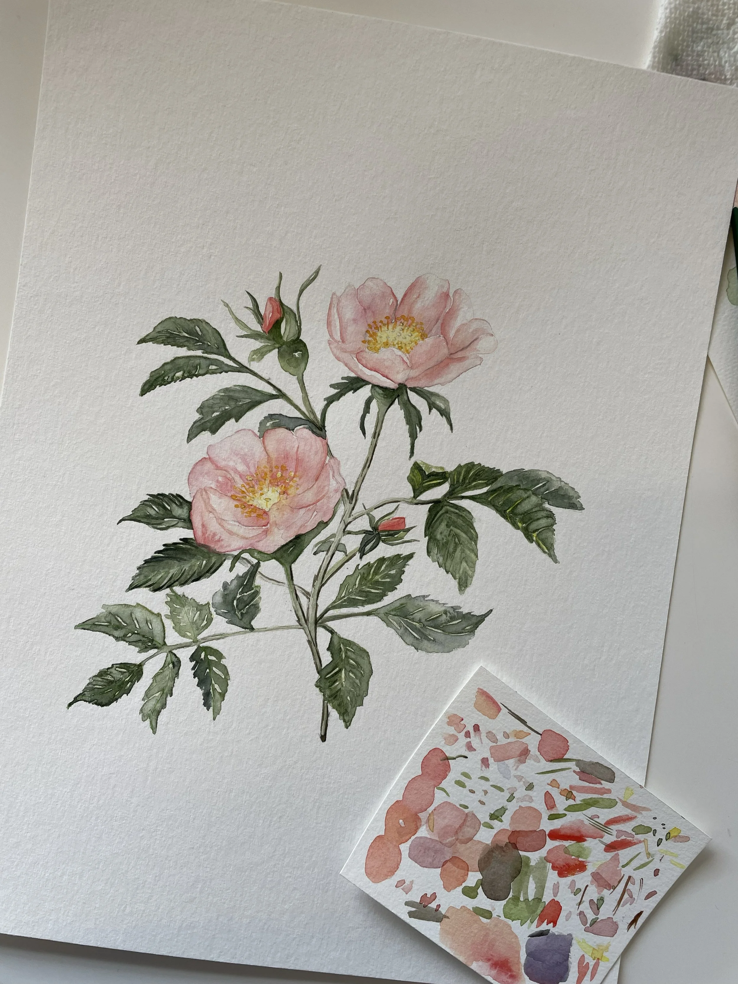
Wild roses watercolor painting
April was a month of color, warmth, and a little nostalgia in the studio. I spent the past few weeks working on a small trio of botanical watercolor pieces: Wild Roses, Peaches, and Freesia. Each one carries a different emotion, but they all share the same starting point — a single color that kept appearing in my mind.
It was that soft, glowing peach‑orange you see during sunsets, especially near the ocean. Maybe it’s because I recently moved closer to the water here in Boston. Maybe it’s because I’m always dreaming about the Mediterranean — the heat, the fruit stands, the long summer evenings. Either way, that warm peachy tone became the thread connecting these new paintings.
Below, I’m sharing the stories behind each piece, plus links to the originals and art prints so you can bring a little of this warmth into your home.
1. Peaches — A Taste of Summer Nostalgia
Art print link: (link)
The first painting in this series was Peaches. The color in my head immediately clicked with the idea of biting into a ripe peach on a hot summer day — the sweetness, the juice, the sun on your skin. Peaches have that perfect mix of softness and vibrancy, and painting them felt like painting a memory.
This piece is warm, summery, and full of that Mediterranean feeling I love so much. It’s a reminder of slow afternoons, fruit markets, and the simple joy of summer.
2. Wild Roses — Inspired by Summer Blooms
Art print link: [link]
Next came Wild Roses — the kind that bloom freely in the heat, with petals that shift from soft pink to orange‑red. These flowers always remind me of long summer walks and the way the air feels heavy and warm.
The peachy sunset color guided the whole palette. Wild roses have a natural, effortless beauty, and I wanted this piece to feel the same — loose, warm, and full of movement.
3. Freesia — A Personal Favorite and a Touch of Nostalgia
Art print link: [link]
Freesia is the “jolly joker” of this collection — it doesn’t fully match the Mediterranean theme, but it belongs here for a different reason: nostalgia.
I was born in January, and freesia is one of the few flowers you can find around that time. It’s the flower I used to receive for my birthdays, and it has stayed my favorite ever since. I can still imagine the fragrance and the delicate color combinations.
Painting freesia felt like painting a memory from home — soft, joyful, and deeply personal.
The Color That Connected Everything
All three pieces began with one color: that glowing peach‑orange that feels like a sunset over the sea.
It’s warm. It’s summery. It’s hopeful.
And it shaped the entire Spring collection.
Shop the Originals and Art Prints
If you’d like to bring one of these pieces into your home, you can find them here:
Each print is produced on high‑quality paper to preserve the softness and detail of the original watercolor.
A Month of Warmth, Color, and Memory
April’s paintings were a blend of Mediterranean daydreams, Boston sunsets, and personal nostalgia. They reminded me how much a single color can spark a whole story — and how painting is often a way of remembering.
If you’d like a behind‑the‑scenes look at the process or want to see what I’m working on next, you’re always welcome to visit the studio on Sundays or First Fridays.
Love,
Reta